As in a social context, all of us have mental models slightly or largely different from another person about the same event; enterprises are also congregations of humans that have diverse mental models. This leads to consumption of business information at differing degrees of understanding and usage.
Recent emergence of data, a critical ingredient of enterprise effectiveness, still has to overcome the limitations of human cognizance in consuming data well. Current trends like “ubiquitous and voluminous data (Big Data)” and “insights/relevant data (analytics)” still cannot be consumed effectively by all, since enterprises consist of human beings that have differing dispositions — either by virtue of their functional roles or even sheer lack of time to focus on what the data really conveys.
Thus, limitation of human cognizance, differing mental models, semantic differences or mere paucity of attention sub-optimizes what this data revolution portends for enterprises.
Data has buried perspectives that analytics is expected to bring about by examining the intuitive relationships and also unearthing the not-so intuitive ones. Even the most apparent correlations are not understood by all coherently, let alone the non-apparent correlations.
Lack of common understanding could lead to actions that are asynchronous and leave even the team members with the best intentions acting in silos, which will stall the effectiveness of enterprises or could even be counterproductive.
For example, revenue that is likely to go up in a certain geography need not be the complete information unless the context is understood by all. It could be that a revenue upside may be more detrimental than flat revenues since the cost of goods or services to realize this revenue could dilute the profitability of the entire enterprise. The revenue growth will be viewed as a good event by the sales team, but the same growth will be viewed with anxiety by the finance/operations community since it will erode the bottom line.
One of the actions associated with this information could be to limit growth in this specific geography and balance it out with another geography/segment. But conveying this is hard since many organizations are not nifty enough to make the change, which primarily stems from varying priorities and outlooks despite the data conveying pithily the needed action.
Even such a simple data point has varied connotations to a set of people in an organization. This phenomenon becomes more acute since real-life enterprise data is more complex and the enterprises are also very distributed.
Imagine a set of business leaders joining their weekly worldwide conference calls from various time zones and some of them even from airports. For them, understanding the ever dynamic business data in a common way itself is hard, let alone, agreeing on the important actions that the data seems to suggest.
If enterprises are helped with ways to consume data meaningfully and cohesively (across many functions and people), the promise of Big Data and analysis could be converted into enterprise effectiveness.
Pictures are better than 1000 data points
The possibility of creating coherent thinking in the teams improves when these data and insights are shown as pictures, that is, when the data is “visualized.”
The ability of visualization to help consume and understand data better can be further established using the following example of sales vs. price variations of four cities. This specific data set (though very simple compared to real-life enterprise data) is employed here for illustrative purposes. (Note: Classical Anscombe’s quartet example in statistics is overlaid with a business context in the following example.)
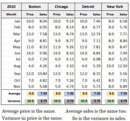
Figure 1: Tale of Four Identical Cities?
 Take a look at the sales report in Fig. 1. A company has branches in four cities, and each branch changes the product price every month. This leads to a corresponding change in the sales. Fig. 1 shows the performance of the four branches with their monthly price and sales for each month. Looking at the average, the four branches have identical performance.
Imagine a set of people coming together to understand the above set of numbers and interpreting them within their individual contexts. Most of them will walk away with the concept that each of these cities is doing as well as the other. Imagine one team member trying to convey that these numbers tell a story that is a lot different from what is apparent. How difficult it would be to connect to the various minds in this congregation if the only available tool is this data set — albeit small in size.
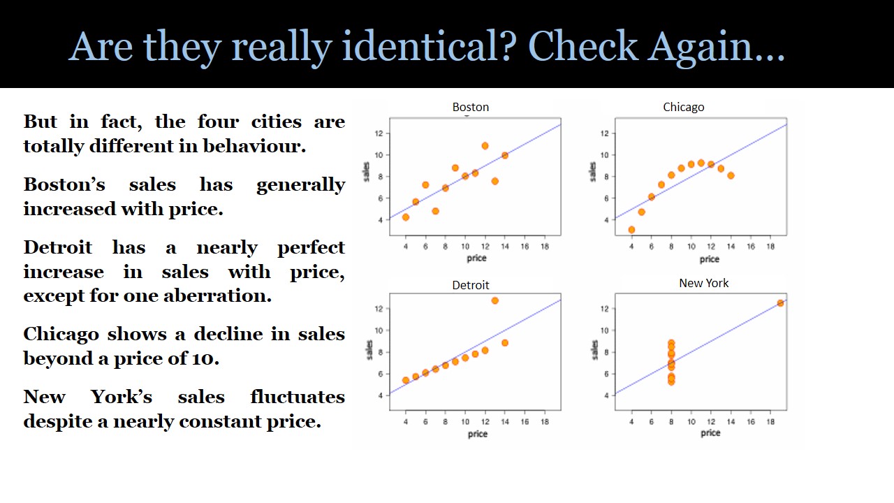
Now if the same set of numbers is visualized (or graphed); it becomes much easier to convey that each city is different and actions needed are very different in each case.
Figure 2: Are They Really Identical? Check again.

In fact, as Fig. 2 shows, the four cities are totally different in behavior. Boston’s sales have generally increased with price. Detroit has a nearly perfect increase in sales with price, except for one aberration. Chicago shows a decline in sales beyond a price of 10. New York’s sales fluctuate despite a nearly constant price.
This example epitomizes the need for visualization tools to help the human network in enterprises to consume even simple data coherently. In the context of Big Data consumption, the relevance of visualization tools becomes more pronounced.
Some visualization elements that have been used for a while
Line graphs, bar charts and area maps are classical ways to picture data. The visualization thought process will further harness tree maps, cluster plots, jitter plots and network diagrams to make the application of visualization more enabling for businesses. Application of visualization for a real-life enterprise whose data is dynamic, distributed and even unstructured will draw on the entire repertoire of classical visualization elements, and even new ones could be invented.
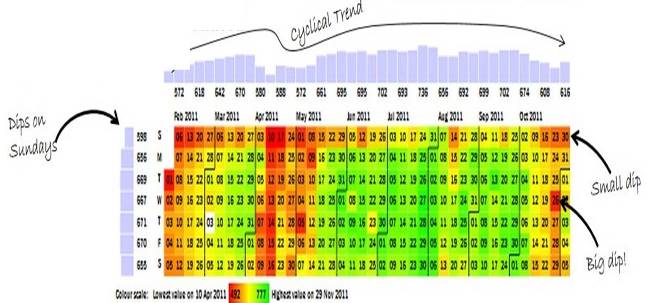
“Calendar maps,” which represent “colored dates” based on an underlying value, convey quite a bit of information easily consumable by many people together in one example worth mentioning.
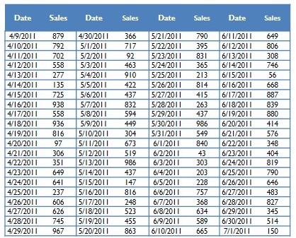
Figure 3: Example of Calendar Map Visualization


Look at the data in the top table in Fig. 3, and determine when sales were the highest.
Now try the same with the visualization in the second table in Fig. 3. This data shows many patterns. Importantly, it takes less than 10 seconds to spot them. Reports are more than just data. They’re actionable insights. (Red shows reduced sales, green shows higher sales).
In an enterprise that is a network of diverse and distributed human roles, the bigger the data, the more complex the analyses and deeper the insights. Limitations of human cognizance to consume this information (data) need to be aided with tools like visualization. This will help enterprises as they prepare to use the wisdom promised by the recent data revolution.
This also brings about opportunities for IT service providers, system integrators and OEM software product vendors to further hone their data and analytics offerings with tools like visualizations to help their enterprise customers.
Blending art and science in visualizations
Although visualizations are easy to understand, the creators of visualizations need to combine techniques of infographics, statistics and programming. It is a good blend of art and science since representation needs to be appealing and useful at the same time.
Big Data and analysis have created specialized professions like data scientists; and in the initial stages of evolution, most visualization practitioners could well be an extension of the data scientist profession; after all, data scientists need to have a platform to convey well what they have analyzed.
As these techniques mature, each element of the visualization palette like color, order, space, shape, density, chronology and position will be redefined, stretched, morphed and recombined based on the underlying data to tell a story that many minds can easily understand together.
Imagine a nation’s map redrawn with relative sizes of the territories defined by the population density as opposed to relative geographical sizes. Imagine an audio presentation where the voice of the narrator increases in pitch based on attention needed for certain data patterns of a business. Imagine a collage of words where their relative sizes and colors are defined by the underlying budget data of a nation. All these and many more will be (are) combined with statistical techniques to help consume data patterns and insights better.
The data visualization treatise in this article is limited to data consumption patterns in enterprises and does not attempt to purport any of the many, varied other applications of data visualization.
Visualization will further envelop all of us, individuals and businesses alike, in the coming years to help us consume data better individually and collectively. If unaided by such tools, Big Data will be akin to quenching thirst by standing at the foot of a waterfall — soaked wet but hard to consume!
J.Ramachandran (Ram) is the founder and CEO of Gramener, a data analytics and visualization company. Earlier Ram was CEO of Birlasoft and Cura after being with IBM over a decade in the United States, where he led large value technology implementations for Fortune 50 customers. Follow him on gramener.com, blog.gramener.com and on Twitter.
