Data is everywhere. The more we collect and analyze, the smarter we become and the more capable we are to make critical business decisions.
Big data, as it’s commonly known, enables decision makers to collect and record massive amounts of consumer information; business intelligence (BI) platforms analyze that data and make it easier to consume. Decision makers can use BI tools to determine baseline key performance indicators (KPIs) across different metrics, allowing them to constantly optimize sales flows and other business processes.
Mathematical modeling and predictive analysis insights have become commonplace in BI platforms, and give decision makers the ability to access, view and segment every aspect of a business’s data. Answers to questions like, “How many male users between the ages of 30-40 accessed our website from mobile devices in January?” are now relatively easy to uncover.
But with more data comes more clutter. While BI transforms how businesses view and interpret data, it brings a new issue to the table: consumption. We’re now overwhelmed by the sheer quantity of textual information, bogged down by numbers and variables and suffering from an inability to process that information.
At the core of this problem is an organizational restructuring that naturally occurred in order to accommodate for such large amounts of data. It departmentalized the data analysis processes and workflows within the business, thereby significantly separating those who are sifting through the information from those who are making the decisions.
To alleviate this ailing concern, a new method of data interpretation hit the scene: data visualization. It helps businesses make data-driven decisions by drilling into and understanding the patterns and sequences they can extract from real-time, big data collection.
Data visualization represents a fundamental change in how we interpret and act on data, allowing decision makers to directly interact with the information that’s needed to make an informed decision.
Data visualization accomplishes this feat in two ways: first by providing a visual aid through which to peer at data, and second by permitting the collection and organization of real-time data that’s accessible anywhere, anytime.
Below is a breakdown of these two elements that are inherent in data visualization tools.
1. Views and visualizations through which to peer at data
Traditional data mining methods involve drilling into data by creating queries and filters, with each query representing a segment of data. If it sounds a little complicated, that’s because it is. The average business owner looking to collect and analyze big data has no idea how to compare different segments of data and identify trends or get any sort of actionable insight out of traditional methods.
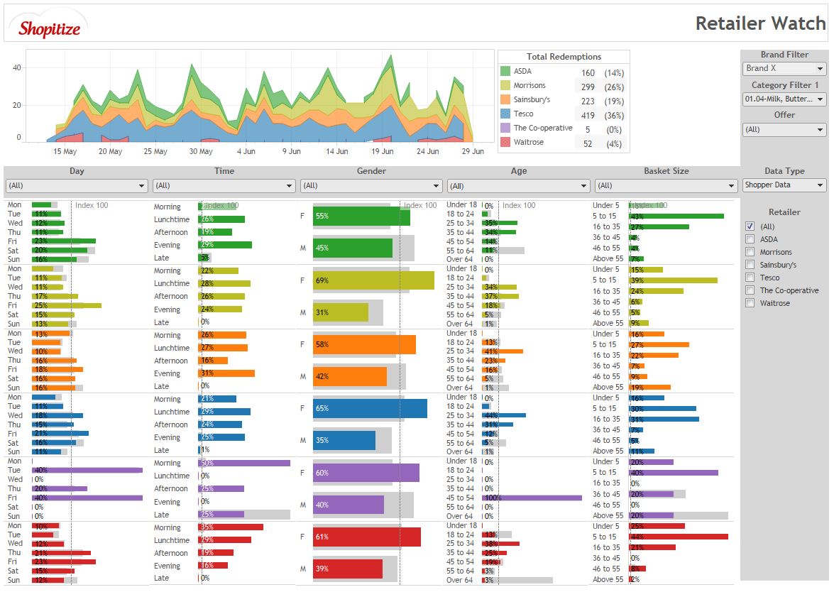
Moreover, BI platforms that allow for traditional methods of data mining do not evoke a sense of creativity or actionable inspiration. But why should they? Data should be dry – it is and always has been. Take a look at the user interface of a BI tool (see figure 1).
Figure 1: User interface of a business intelligence tool

Source: Tableau.com
But data visualization essentially brings this dry data alive by organizing the information into visual aids that users can easily interpret. If an image says a thousand words (as the saying goes), then a geotargeted real-time map of the world that records a company’s sales across different products says about a million words.
When it comes to big data, changing the user’s view changes the perspective. So when businesses use data visualization software, users are able to move through different perspectives of the same information by changing the view from a map to a flow chart to a balloon chart or any number of other viewing lenses.
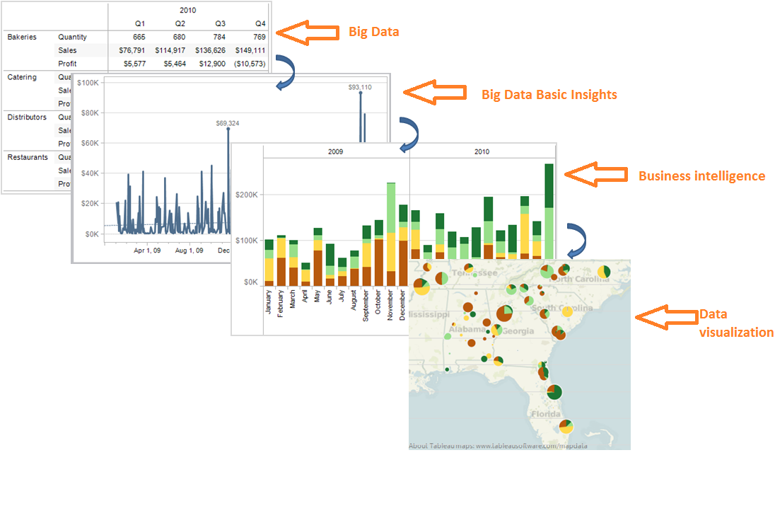
Let’s have a look at the progression of data and its visual aids as it moves from basic big data software to data visualization tools (see figure 2).
Figure 2: Progression of data moving from big data software to data visualization tools

Source: Tableau.com
Now consider this simple, albeit highly relevant example: When navigating in an unknown country, it’s significantly easier to get around with a Google Maps app than with a traditional paper map. Why? Because Google Maps lets us identify our exact location, zoom in, zoom out, track our progress and get a step-by-step breakdown of where we need to go to accomplish our goals.
2. Collecting and organizing data in real time for viewing anywhere, anytime
The rise of software-as-a-service (SaaS) applications and mobile devices facilitated the proliferation of the recent big data phenomena. As mobile applications continually lead the charge for market share, more and more executives see the benefit of live data visualization feeds that are accessible from their tablets.
Live, on-the-go data visualization dashboards create an instantaneous integration across all verticals (manufacturing, distribution, marketing, etc.), essentially allowing decision makers to visualize their entire business process. By monitoring real-time analytics across all business segments, decision makers gain actionable insights that they can then use on the spot.
With more and more companies sprouting up that offer data-visualization solutions, the market is becoming increasingly more competitive and the tools more feature rich. As is the case in many other examples of the B2B SaaS landscape, data visualization solutions are beginning to allow heightened levels of collaboration.
Many data visualization software providers compete on the framework of offering more collaborative aspects to their products. By allowing users to share their thoughts and comments on live commenting feeds, and by viewing live activity streams to see who changed what and how this affected the big picture, these tools are becoming more collaborative and versatile. Team members are able to bounce ideas off each other without having to leave the platform and can therefore make team-based decisions on the spot.
It’s undeniable that the term “big data” has a tendency to overwhelm many business owners. It brings with it the connotation that only tech-savvy statistics experts are capable of handling such magnitudes of information.
But data visualization software brings this ability to the small business community, giving these professionals an easy and impressive way to illustrate their business’s core functions. Just like Google enabled small companies to compete with large ones for online customers, so too will big data visualizers allow startups and SMBs the ability to come together and make big decisions for their respective companies.
The future is in the data.
Roey Libfeld is head of business development and market research at Discovercloud.com. Roey is an expert in the field of big data and an eager researcher of the B2B realm. He’s motivated by the notion that there is a solution to any business need. Roey has started consulting with B2B companies on how to achieve maximum productivity.
